Data Cleaning, Processing and Extraction
I was requested to perform an annual Customer Database Credit Analysis in order to see all customer’s behavior regarding Risk Category, Payment Terms, Average Days to Pay, Credit Limit, Sum of Invoice Balance, Gross Sales Volume from current and prior year.
After extracting all the information from the database, creating a pivot table to show the most relevant information and combine specific company codes, specific years, etc. I finally had a dataset I could work with that I could clean and process.
I had this dataset to start with
> colnames(credit)
“CC” “Customer.Name” “Customer.Number” “Risk.Category” “Current.Credit.Limit” “Payment.Terms” “Average.of.ADP.Year” “Sum.of.Invoice.Balance” “Sum.of.Prior.Year.GSV” “Sum.of.Current.GSV”
Data that I had to clean and process as follows:
> colnames(creditv3)
“CC” “Customer.Name” “Customer.Number” “Risk.Category” “Current.Credit.Limit” “Currency” “Payment.Terms” “Payment.Terms.Days” “Average.of.ADP.Year” “ADP.to.PT” “ADP.Comment” “Sum.of.Invoice.Balance” “Sum.of.Prior.Year.GSV” “Sum.of.Current.GSV” “GSV.Difference” “GSV.Comment” “Invoice.to.GSV”
Customer Dataset

As it can be seen I added important columns that will be quite helpful for vizualisation, such as:
Payment.Terms.Days: In which I extracted the number of days from the whole text to compare against ADP (Average days to pay).
ADP.to.PT and ADP.Comment: In which I can compare how much does it take for the customer to pay, comparing ADP against Payment Terms Days, and whether it pays on time or overdue, which will also be very helpful for visualization.
GSV.Difference GSV.Comment: In which I compare how much of an increase or decrease every customer had from prior year, and the GSV comment which will tell me whether the customer increased or decreased which will be helpful for visualization as well.
Invoice.to.GSV: Lastly this comment which is a comparison of Sum of Invoice Balance against Current GSV which is an important metric that can tell you the situation of the customer.
Data Visualization

ggplot(data=creditv2, mapping=aes(x=GSV.Difference, y=Invoice.to.GSV)) +
geom_point(aes(color=ADP.Comment,shape=GSV.Comment))+
scale_color_manual(values = c(“On Time” = “darkolivegreen3”, “Overdue” = “brown2”))
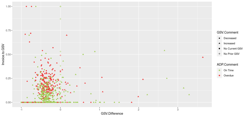
In this first visualization it can be appreciated all the customers as a whole, regarding whether they had and Increase or decrease in GSV comparing against prior year, and how much the sum of invoice balance represents compared with the current GSV, also the distinction of ADP Comment in color, whether the customer pays on time or overdue.

ggplot(data=creditv3, mapping=aes(x=GSV.Difference, y=Invoice.to.GSV)) +
geom_point(aes(color=ADP.Comment,shape=GSV.Comment))+
facet_wrap(~Risk.Category)+
scale_color_manual(values = c(“On Time” = “darkolivegreen3”, “Overdue” = “brown2”))+
scale_x_continuous(breaks=seq(-1,5,by=1))
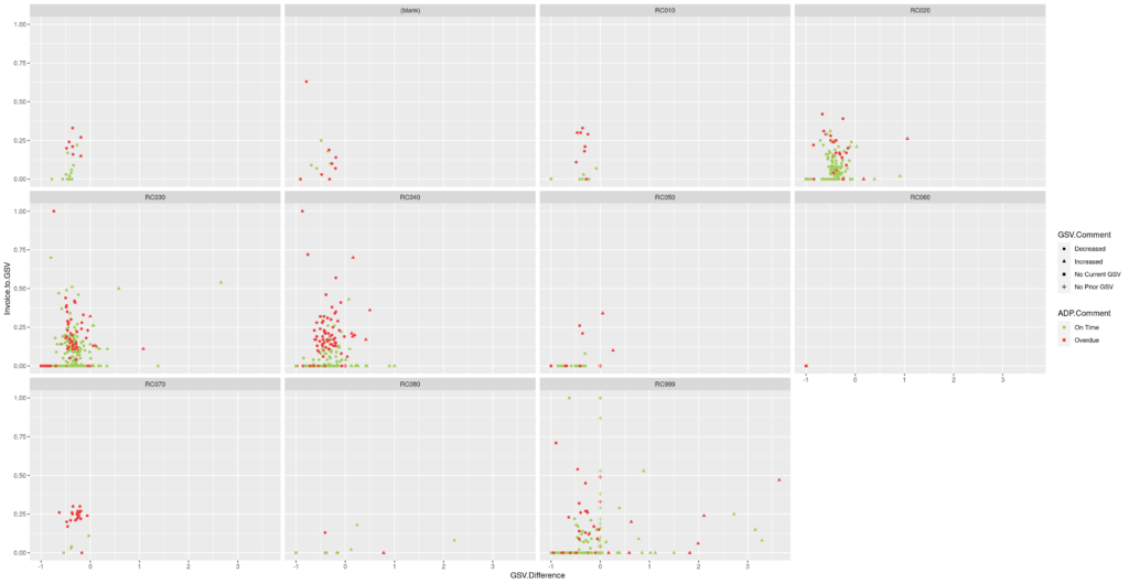
Then this second visualization was generated, in which it can be appreciated the population grouped by Risk Category, making it easier to target specific groups and suggest a credit limit
Conclusions
After cleaning and processing the dataset, we have generated important metrics which are quite valuable when evaluating a customer’s behavior in order to determine whether its credit limit should remain, increase or decrease. Thanks to the visualizations, the job can be done in no time as the population can be viewed as a whole and as a group of its own and then targeted, then based on its behavior the proper suggestion can be made.

